EVALUATION

For my A2 media coursework, I was required to create a film trailer and then a poster and film magazine cover as ancillary tasks. As a team we decided to make a horror film trailer. To do our tasks we were required to research into the genre and the products we were making so we had some influences of how we would them to look in the end. We thought it would be best to start the filming process as soon as possible so we had more time at the end for editing or doing our ancillary tasks. Although our trailer is aimed at teenagers and above, we thought we would keep the cast minimal and also relatively young. We went along with the conventions of a horror film as we based the trailer around a cloaked figure, wearing black, a stereotypical colour of the genre. The trailer also includes teenage girls, a common target amongst horror films. We decided for the opening of our trailer we would begin with an establishing shot, to set the scene for the audience, we then proceeded with the production logo. It is followed by a clip of a door opening and then the second production logo is shown on screen. Our logos, were created to fit the genre and trailer specifically. The key features we needed were either put at the beginning or end. We had the logos at the start and all the production credits at the end. When researching film trailers to influence ours, we took note of the conventions that are included as we knew that there were specific features that would be used within a trailer. The main conventions are; the title, production logos, the release date, sound, institutional details and cast members. These are seen in every film trailer so we researched them and later included them in our trailer.

The title, we placed near the end of our trailer as we wanted to include some extra footage right at the end as we had seen this done in many trailers that we researched.We input the cast names with the institutional details on the same page as the film title, we did this as we didn’t not want to oversell the trailer based on the cast members but to concentrate on the narrative and the genre.The release date is shown on the following page, it is situated at the top centre of the page, above the website and social media links for our film.For the production credits, we had the names of the cast members, directors, executive producers and the production companies behind it all.

We used some copy in our trailer, we included the title and production credits towards the end. In between some clips we input text saying, ‘YOU CAN’T RUN’. We placed the white text against a black background and capitalized the text to make it more prominent. At the end of our trailer, we finish with a black screen with the words ‘THEY’RE NOT ALONE IN THIS HOUSE’ this we decided was to be out tagline, we decided this when producing our poster.

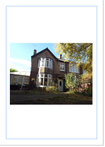
For the poster, we followed the conventions of what is included;the main image, we placed that in the centre as it is the main focus. We used a house as the main image, we edited it to black and white and it made it look like a creepy old house- typical of the horror genre.
As it is a horror film poster the colouring was obviously going to be limited, we stuck with black and white as we knew this would work and look simple and not overcrowded with too many colours.
The cast names are featured in the production credits as we thought it is mainly films with well known actors where the names are displayed on the front of a film poster. We knew our film was suited for the teenage/young adult demographic but the trailer isn’t graphic or include anything overly scary. We placed the age rating under the title so it is visible for the audience to see but doesn’t overpower the title. We also included a tagline as we did on the trailer too, we wanted to show continuity between our ancillary tasks and our main task.
At the bottom of the poster we have all the important features such as the release date ‘8.10.15’, the production credits, the social network links and the production company logos. Overall I think the poster has a gothic feel to it that suits the horror genre well and that compliments our film trailer. We did originally want to produce a teaser poster to go with our main poster but we decided we could only do this if we have extra time which we did not. We were planning to use the old photographs we found on the internet with the cloaked figure in the background and just the film title and release date on.
 figure image 2
Main poster
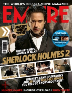
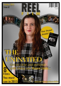
When researching film magazine front covers we came across the typical things that feature on them so we knew which ones we needed to include and which we didn’t need to.
We included the name ‘ REEL FILM’ at the top centre, the main image situated in the middle of the cover as it is the main focus and sell point of the magazine.
The main anchorage text is sat towards the left of the cover but partly covering the main image, we wrote about our film and we used one of the actors as a way of advertising the film. ‘Get up close and personal with rising star Dawn Little’, this gives the audience an insight into one of the actor’s lives, persuading them to buy the magazine then they may want to see the film. We include a ‘free poster’ with the magazine, this is also attracting an audience, we noticed that some magazines do this to entice a larger audience. We put that information in a yellow circle known as a puff, this makes it stand out more to the demographic.
We used the word ‘Exclusive!’ in one of our sell lines, to make the text more desirable to read, this is common amongst magazines,it hooks the reader as if they need to read it immediately. We placed images of upcoming movies in the film reel we placed under the title, when an audience see that the magazine features films that they ant to know more about that may make them want to buy the magazine more. We put the barcode and price in the top right corner and the issue number and date in the left top corner. These are necessary for a front cover but we didn’t want them to overcrowd or overshadow all the other important features on the cover.
Magazine cover
Overall I think our ancillary tasks compliment our film trailer well, I think they could be used as marketing tools in the film industry to sell our film to the demographic. the film poster uses the house in which we based the majority of the narrative of our trailer in. This links our poster and trailer automatically, we wanted to show continuity between them so we also included the tag line and all the production credits, social network links and release date.
The magazine cover also links with the poster as we advertise that we are giving a free one away when the magazine is purchased. This is realistic as in real magazines free gifts are always popular. When constructing it we knew we wanted to give away something and it made sense for it to bet the poster as the main story is based around one of the actors and it would be more interesting if we were to link our products together.
As seen in a previous post, we carried out a survey to 65 GCSE film and media students to get their honest opinion on our film trailer, we gave them a questionnaire to fill out and below are the results and what they tell us.
AUDIENCE FEEDBACK
What was the genre of the film?
genre
Luckily for this question, all of the audience knew clearly that we made a horror trailer. This obviously means we portrayed the typical conventions of a horror film trailer well within our work. We were happy with these results and we are glad that every one of our audience chose horror.
What age rating do you think this film would have?
Age rating
 60% of our audience said that they thought our trailer would be rated a certificate 15, we were impressed by this as it means we portrayed just enough scariness but not too much to make the majority think it would be a 18.
18% said 18, we can see that we did include some scary scenes in the trailer but we also do not think it needs an 18 rating, within the trailer we didn’t show much terror, swearing or violence. We also understand that certificate 12 is very close to the 15 that we decided to make our trailer, 14% said 12 and 8% said 12a, we do think that these ratings are quite low but are understandable just from seeing the trailer as there isn’t any footage overly harming for people that age.
Would this trailer encourage you to view the film in cinemas?
Would this encourage you to see in cinema
Our trailer clearly made a positive impact on our audience as nearly 3/4 said they would want to view this film in cinemas. This is good for us as we know that our film would be successful amongst our target audience.
If not why?
If not why
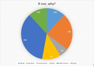
Of the 26% that said they would not want to see the complete film, we asked them why they didn’t and we had a wide range of results. 35% said that they didn’t like the horror genre so therefore they wouldn’t enjoy the film, this is something as a group could not prevent. You can’t make the audience like a specific genre. 23% said they wouldn’t see the film due to the narrative, due to it being a two minute trailer, there is only so much of the narrative you can give away and that 23% obviously thought that the part of the narrative we did give away wasn’t so interesting and gripping. 12% said acting and another 12% said editing, we realise as a team that there are some parts on our trailer where the acting could have been executed better and improved but as for the editing skills, we think we did as best as we could with the equipment that we were provided. 6% stated that the issue was the music and sound, this is a very important feature to a film trailer and if the music doesn’t build the tension and make the film look interesting then it wont be too popular.
What do you feel worked well in this trailer?
what worked well
Although from the previous question a lot of the people said that they wouldn’t see the film due to it’s narrative, 37% of people this time said that the narrative was the part that worked best in our trailer. Followed by 26% of the audience that said the music and sound were the part that worked best on the trailer. 15% said editing, we were overall very proud so far as these were the key parts of the trailer and the parts needed to grip an audience. 11% said camera work and 6% said mise en scene worked best, closely following that was the lighting at a total of 5%, this pleased us as our audience seemed to be impressed with all the features that we thought about more and spent more time preparing.
Do you feel the narrative of the film is shown clearly in the trailer?
Clear narrative
95% of our audience said they think the narrative is shown clearly within our trailer, so our thoughtful planning and preparing was all worth it in the end. The 5% of our audience that said the narrative was not clear, is only a small percentage, if it were higher then we may consider re shooting some of our trailer. If the audience didn’t feel the narrative was shown clearly then we asked them ‘If not why?’ however those who chose this option did not write where we asked them to so we could not make a pie chart out of our response.
Is there anything you feel could be changed in order to improve it?
Improvements
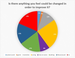
25% of the audience said the acting is in need of improving, we knew that the acting in our trailer was not as good as it could have been, but we only think there are a few scenes where this is an issue.But if we had more time to change our trailer we would re shoot these scenes. 18% said there was nothing that they could see needed improvements in the trailer. Closely following this by 17% is both music & sound and editing, both are very important in a trailer, we thought that we had gotten both of them right when editing and reviewing our trailer so we didn’t see the problem. We understand that if you don’t think the music suits the genre or the clip then it makes it less interesting to watch, this is same for the way in which the trailer is edited, if an audience find it’s not up to a certain standard they will not want to watch more. At 11% is narrative, this is also a key point when producing a trailer but with only 11% saying it needs improving, we know that this could be improved if we were to spend more time planning and make a more detailed storyline. Mise en scene has 8% of the audience vote for what needs changing, as our trailer was only set in a few different locations, we didn’t need to change much, we had certain props such as the edited photos with the figure in, we also had a costume for the figure and just casual clothes for the teenage girls. Some of the mise en scene had more thought behind it compared to others but to change it we would definitely plan out our scenes more and make them possibly more interesting yet still not dragging the attention away from the main focus that is the acting and narrative. Camera work and genre follow with 3% and 1% this is a good result for us as we know that the overall look of the trailer was good and the genre is only an issue if the audience doesn’t like horrors.
We used several different pieces of equipment when making our trailer, we used a video camera and tripod provided by the college to shoot everything in our trailer. We also used my Fujifilm finepix s8500 digital camera to take the photo in my house when Georgia is in the living room and we input the ghost figure into the same photo.
figure image final camerqa
We used Serif DrawPlus to make this image, we used the ‘cut out studio’ on the software to get rid of the figure’s white background and increase the transparency and then we placed it so it was hidden behind the draws.
We also used ‘Serif DrawPlus’ to produce the poster and magazine cover, our methods of doing so are shown in the individual posts about them. To make the trailer we used Adobe Premiere elements, which we found quite simple to use. We added footage as we filmed it, we then edited the clips and kept the parts we need and watched them over to see if anything needed re shooting.

ANCILLARY TASKS – MAGAZINE COVER

We looked at various different magazine covers in our research and we wanted something simple, that focused on the main image and not featuring too many images of other films.

We decided on a name for the magazine, we thought it would be a clever play on words to call it ‘REEL FILM’ we then knew it had to feature a film reel on the cover.

mag 1mag 3

We thought the film reel would look good directly under the magazine name. We included images in the spaces in the film reel, these images were of upcoming films when we originally created our magazine cover.

mag 4mag 5

In the next stages of making the magazine cover, we added a curved feature in the bottom left corner. We decided on our colour scheme, we knew we wanted black but we also needed a contrasting colour too. We considered red and black but we thought that may be to cliche for the horror genre, we wanted something subtle and not overly suggesting horror. So we decided on yellow and black, it isn’t overly feminine or masculine, to keep a wider target demographic. As for the font, we tried to keep it as close to the text on the poster and trailer as we could. We had some text in different fonts to show a range on our cover and to differentiate between the other text featured.We then filled the curve with a mustard yellow, a colour that would compliment the black outline. We added the image of an upcoming film ‘The Avengers: Age of Ultron’, next to the caption, ‘8 films you must see in 2015’.

mag 6mag 7

We had Dawn be the model for our cover as she was one of the main characters in the trailer. We made sure she gave a direct mode of address to the camera, as we found that this is very popular on magazines as its almost as if the person is addressing the reader directly and persuading them to buy it. We dressed her in dark clothing to fit with our genre of horror. She also wore red lipstick, red in horror films often implies; danger, blood, so we thought it would be quite fitting and also it makes a contrast against the darkness of the magazine cover as a whole due to the dark metallic background. For the main image it self, we used the cut out studio on Serif Draw Plus to cut out the background away so we could then place the image on a new background as it would be easier for when we put all the text and other images on.

mag 8mag 9

Next we inputted the magazine name, partly covering Dawn’s head so it was visible.. We added the main feature copy on top of dawn’s torso. It took a lot of time to decide what font and colour to choose, we went with the matching yellow as we didn’t want a clash of colours or too many of them on the cover.

mag 10mag 11

The necessities were included on the cover,we have a barcode in the top right corner, just above the price, we put the price at £3.99 because when researching we noticed that most film magazines are issued monthly and are similar to this price. Along the bottom of the cover, we included exclusive access the fallout of ‘Vintage House Pictures’ our production company from our AS project. This is a selling point to the audience as they may be interested in the details that would be provided within the magazine.

Magazine coverTHE FINISHED MAGAZINE COVER

This is our final magazine cover, the fact that we included a ‘free poster’ with our magazine show that we linked our ancillary tasks to our main one. From researching magazine posters, we found that many tend to give away free items, so we thought it would encourage a wider audience. We like how it has turned out and are pleased with the result,we think that it compliments the trailer well.

ANCILLARY TASK – FILM POSTER

We began thinking of ideas for our poster quite early on. We wanted something simple, we looked into different film posters and we all analysed different ones for our research. We came up with various ideas; where the figure could be stood in a window and one of the females stood outside or one of the girls stood near a record player with a candle or a lit match to illuminate her face- we thought we could photograph this when it came to filming this scene in the trailer.

After much debating, we settled on having a big spooky looking house as the main focus. This would be the house where all the drama is set in the trailer. We would use my house for the image as it features in the opening scene in our trailer.

For the actual image, I luckily already had a variety of photos of the exterior of my house that i had taken for my A level photography project so we uploaded them all and decided on the best one for the poster.

DSCF1250

We settled on this one, we liked this best due to it having the best angle that we thought would fit well with the genre. I took this image from the ground so it’s from a low angle which makes the house look even bigger than it is from a low angle shot.

1

To make our poster, we used the program ‘Serif Draw Plus’, we uploaded the image onto it and placed it into the centre but we decided to move it around later on in the making process.

23

We then edited it to black and white to give it more of a horror feel. We made the background black and we planned to have white text on top so it should be clearly visible and we positioned the image on the poster where we thought it should go.

4

Here we added the title and we spent a lot of our time raking through all the fonts on the software to find one suitable for our poster and to suit the genre well. Our title ‘THE UNINVITED’ looked best situated at the top of the poster, in capitals to make it more prominent.

56

We used a brush tool on serif draw plus similar to a spray paint as we thought it would be fitting with the trees and create an eerie atmosphere. We also added the production logos and adjusted the colouring to fit with the dark colour scheme of the poster.

78

We then added the social media links and a website. We then made a tag line, we decided this last minute, when we were piecing the poster together. We eventually settled on ‘THEY’RE NOT ALONE IN THIS HOUSE’ we thought this flowed well and decided that having ‘THIS’ in italic to make the audience prolong the speech of the word. We also made up a release date; from our research we knew that it is very common for horror films to be released close to Halloween so 8/10/15 seemed a suitable and realistic release date.

9

The age certificate was something that we needed to be noticeable but not as bold as some of the other text on the poster. We placed it underneath the title and towards the right so it didn’t distract the attention away from the title.

We copied our production credits from the end of our trailer. Having these on a poster is important so the audience know the main cast members and the main people involved in the making of the film. We took our time organizing the layout of the poster, this involved the font and size of all the text and which bits needed to be more noticeable.

This is our final poster, as a team we feel as though it reflects our film well and suits the genre.

Main poster

AUDIENCE SURVEY

After producing our film trailer, we were required to create a questionnaire based on our finished trailer. This was used to collect audience feedback, which is useful in case anything needed changing at last minute. Our trailer was shown to 65 GCSE film students aged between 14-16 which was a blessing for us due to our trailer having an age rating of 15. So we knew we would receive accurate feedback.

Before making our final questionnaire, we drafted some questions, and chose the way that they would be phrased and thought of the options for answers for the tick the box questions.

survey

This is our finished questionnaire, we included the title of our trailer and some of the production credits as well as our logos. As for the questions, we made sure they were simple and concise and suitable for our target audience to answer and understand. We also wanted to include a mix of written answer questions and box ticking questions, to make it faster of the people answering them.

We have received our results from our questionnaires and have collated them into tally charts then into pie charts which will be shown in my evaluation post.

POST PRODUCTION OF THE HORROR TRAILER

We decided it would be best to start the editing process as soon as we started to film our trailer. After our first shooting session, we uploaded the footage we had to adobe elements on our college computers. We put the scenes in chronological order and as time went on and we made progress with our shooting we added more footage and arranged it how it would be in the end.

We also made good use of our media lesson time as we tried our best to find royalty free music to use in our trailer. We found several different soundtracks that we could use, we then decided on our favourite and which one would be best throughout the majority of the film. We wanted music that started off slow and welcoming and then to build up and make the trailer scarier as it is a horror.

As the scenes we filmed in our first session of shooting were at the start of our trailer, we were able to put them in the exact order of how we would need them to be and hopefully they wouldn’t need rearranging later. We also organized our production logos at the beginning of the trailer, so we inputted everything as we made it.

Gradually as we had more and more footage our trailer began to come together and we used a variety of transitions between each clip so that the trailer would run smoothly. The editing process took up a lot of our time due to the software running slowly and the footage needing to be rendered a lot so we spent several lessons and some of our spare time doing this. We wanted our trailer to look as good as possible as Georgia and I we not too impressed with our AS product and we think we have definitely improved our skills since last year.

The first shot shown in the trailer, the establishing shot of the house shielded by tree branches was taken quite late on in the filming process, we shot it in the evening to get a darkish sky to fit well with the horror genre. After this opening clip we put the ‘Placebo Films’ logo, this followed by another short clip of the characters walking into a house when the ‘Timeline Pictures’ logo follows. When it came to editing and arranging all the footage in the correct order, we did make minor changes to what was on the storyboards but mainly we stuck to them. When replaying some clips back we realised that we didn’t need to include all of them or some needed re shooting due to continuity issues so this obviously cost us more time. We included a voice over, recorded by Georgia, this was layered over the top of a clip where the cloaked figure is starting to appear around the house. We recorded her saying ‘There’s something in this house’.

When we had all the footage we added in the text, we put ‘ You can’t run’  in between some footage and then we made the screens at the end of the trailer. These included the production credits, social network links, release date and production logos.

When storyboarding the trailer, we knew there was going to be a record player involved but we needed to find royalty free music so we searched for some online, we found something suitable for the scratching of a record player.

We then looked for some creepy music to act as if it is coming from the record player and we came across some old fashioned music with an aged tune and singing voice, we think it  fits the ending scene perfectly and we faded it out with the end of our trailer.

SHOOTING #5

17/12/14

shooting sch6

We planned to get as many shots as we could done in our media lesson, we found boxes and used the old, edited photos we made.

We found that the lighting worked well and that it suited theses certain scenes that needed re shooting better than when we filmed at Dawn’s house. On our previous day of filming, we tried to film the scene where one of the characters is taking a photo, pointing directly at the camera. When shooting this shot, we found that the camera that we used (Dawn’s) didn’t have a powerful enough flash for the video to pick up on, we thought about enhancing the flash’s brightness and to prolong it but in the end we decided to film this today and use a camera with a better flash. To do this we asked the photography teacher if we could borrow a camera and a flash to create a more powerful effect.

Due to us not being able to get hold of any fake blood before this day, we decided to get rid of shot 38 and extend the length of some of the other shots instead. After shooting shot 45 and looking back on it we decided it didn’t work as well as we planned. We used cutlery to throw at one of the characters in the trailer, to act as if something was being thrown at her and then smashing against the wall. We decided to use cutlery as we realized anything else would be dangerous and harmful.

The shots we filmed the this day were all successful and this was our final film trailer almost completed.

SHOOTING #2

31/10/14

schedule 3

As it is half term and as a group we have had other commitments that meant we haven’t been able to film until this late in the week. We arranged to meet up at my house at 11 am to film a few scenes that didn’t require the darkness of the night. We decided it would be best to film the rest of the scenes after college this week as some scenes require dark rooms and we couldn’t achieve that during the day. First, I photographed Georgia in different positions in the room. We intend to edit the image so it looks like the figure is in the background and then we will proceed to film the camera showing this edited image. I then filmed a close up of Dawn taking a photo with the flash on so we will be able to see the edited image on the screen. We then filmed shots, these required a large piece of black material that I wrapped around myself as I am the cloaked figure in the trailer.

PRE-PRODUCTION

LOCATIONS:

My house;

Exterior- for beginning of the trailer, sweep of house.

Front room- unpacking into new house.

Staircase- carrying box up into loft.

DSCF1250

Dawn’s House;

Dining room- characters enjoying a meal.

Hallway- used to film Dawn crawling backwards.

Georgia’s House;

Front door- closeup on door handle opening

College;

Art Garage- used as a loft, unpacking, finds photos, cloaked figure appears.

Office room- used to film Dawn taking a photo.

PROPS

A box when girls are unpacking into new house.

Edited images featuring cloaked figure

.figure image 6figure image 5figure image 4figure image 3figure image 2

Digital camera to take photo.

DSCF1255 figure image final camerqa

Food for the girls to eat at the dinner table scene.

Torch to shine around room when it’s dark.

Matches.

Record player to play old scary music at the end of the trailer.

Costume wise, we didn’t need the main characters to wear anything specific, just to keep the costumes consistent. For the cloaked figure, I found a large sheet of black material that was big enough to wrap around my body to be the figure, i also found a black mesh mask that would conceal my face completely and would give an air of mystery to the cloaked figure.

CREATING NEW LOGO

As we had made changes to our production team, we decided it would be best to change our logo. We tried to come up with some different ideas. We wanted something simple and that looks clean and neat, we also needed it to compliment the horror genre. we planned on using dark colours to help fit with the genre of the film.

We looked at logos from other production companies and were influenced by them; we were mainly influenced by ‘Miramax’. Their logo is simple and uses a colour scheme of black and white.

miramax-logo

This is our logo, we used Serif draw plus to create this, we used one of our media lessons to do so, we decided this colour scheme would work well together. We think it suits the horror genre well and looks simple and readable and can easily be edited into a different colour scheme if needed to make the trailer or poster look more suitable for the genre,

neni

FILM MAGAZINE INFLUENCES

empire-magazine-skyfall-cover

I decided to choose this film magazine cover due to its simplicity and how plain it is when compared to others that I looked at. The genre of the film featured on the front is not a horror like ours will be but I didn’t think that mattered too much.

I thought the main image was clear and visible enough for the audience to see, the fact that Daniel Craig is portraying a direct mode of address really connects with the reader. Although some of his body is hidden by the main anchorage text and the inset images on the cover, he is still noticeable and having him on the cover will make some people more interested in this magazine already.
On the cover there are cracks in what looks like glass, they have been made to look like it’s a bullet hole and the gun that did them is in Daniel Craig’s hand, linking to the film that is being featured.

The masthead shows the magazine name in bold red but with Daniel Craig’s face covering some of the text. As EMPIRE is a well known and established film magazine, the audience will know what is said even when it is partially covered up.

The skyline makes a link with the main cover story as it shows the 007 icon and states ‘nobody does it better’ next to it, informing that readers that this issue will centre around the upcoming James Bond movie.

The inset images set behind the main image are positioned with a small amount of text above or below it to inform the audience that articles on these films will be included inside the magazine. I really like this idea as it looks like the images are on a film reel behind the main image and i think it suits a film magazine very well.

I really like how the text is minimal on this cover, on the right hand side there are some sell lines to attract more readers, however they are not taking over the page as I have seen on some other film magazine covers.

The main anchorage text partially covers Craig’s body and this makes it stand out more against his black suit. The phrase ’50 years of Bond’, with images underneath showing previous actors who have portrayed the iconic character James Bond, suggests that inside the magazine there will be more information about the past 50 years and the other actors featured on the front cover.

Overall this magazine cover is very visually appealing due to it having the main image giving direct mode of address and the text and images spread across the page making it look clean and easier to look at.

Empire-magazine-cover-Sherlock-Holmes

This is another film magazine influence, I really like this cover due to it having enough information for the readers but not cramming too much onto it. The masthead shows the magazine title in bold capitals, as EMPIRE is a well established film magazine, the entire title doesn’t need to be shown as it is easily recognizable.

The skyline states that EMPIRE is ‘The world’s biggest movie magazine’ promising the audience that this is clearly a very well received magazine and extremely popular and reliable.

The main image is covering part of the title so the focus is on the image rather than the title. The main image is of actor Robert Downey Jr, giving a direct mode of address to the audience, having him feature on the cover will attract his fans to buy this magazine and want to know more about the new film he is in.

The strip of inset images running across the bottom third of the cover, shows screenshots of different films that are coming out soon and are discussed inside the magazine.

There is a puff on the right hand side of the cover, inside it it shows screenshots from a Star Wars film and it explains that there deleted scenes; this gives more reason for people to buy this magazine, to fins out all the extra details inside.

At the bottom of the page, in bold colours, red and white are shown in the text on the strapline, it informs the readers of other items mentioned within the magazine, this gives people more to be interested about, it doesn’t say what details will be mentioned within the magazine just that fact that those certain films will be mentioned.